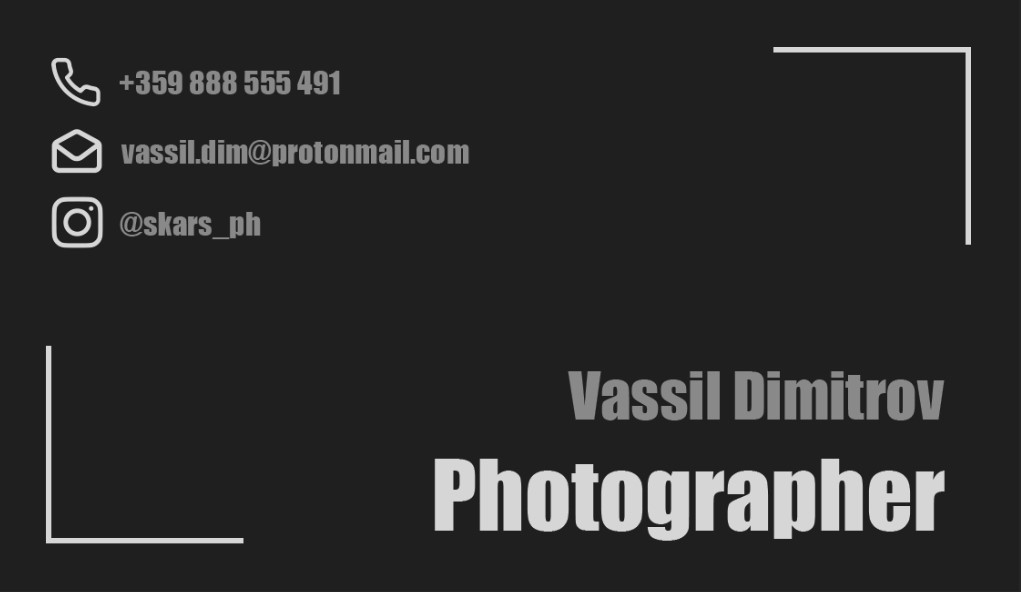
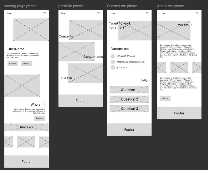
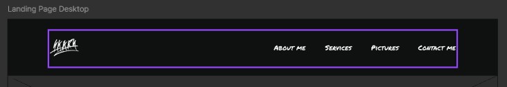
In the screenshot below, you can see the first prototype for my website.
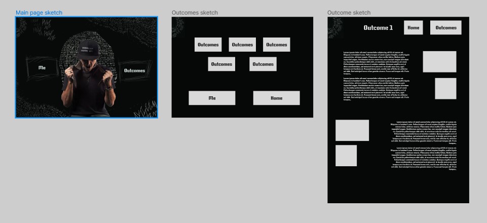
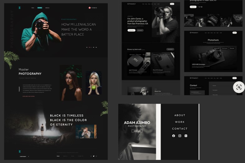
First Iteration
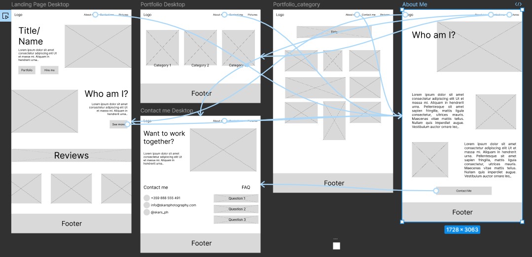
I asked Michael for feedback on the layout and how do I make it consistent, due to the absence of a header. He then told me that I can keep the landing page’s style, but change the others, and include a consistent header there. The result:
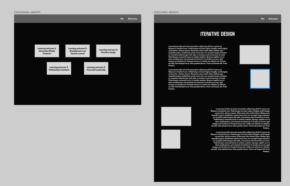
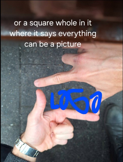
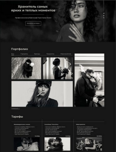
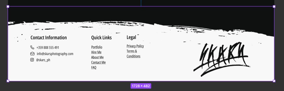
Second Iteration
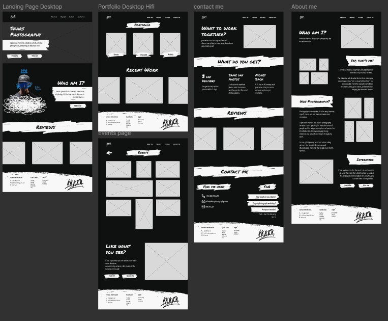
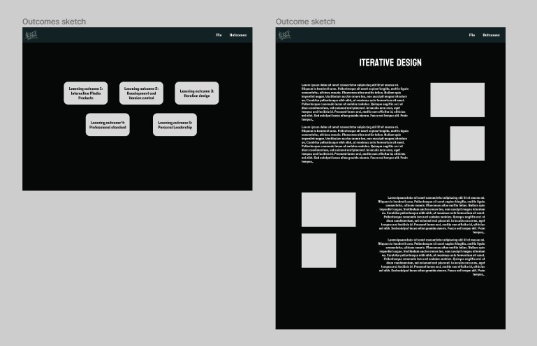
Afterwards, when I started structuring and gathering content for it, I noticed that creating a layout like the one above for the text would be hard to accomplish, and I decided to go with one, where you have explanation first, and then pictures and proof.
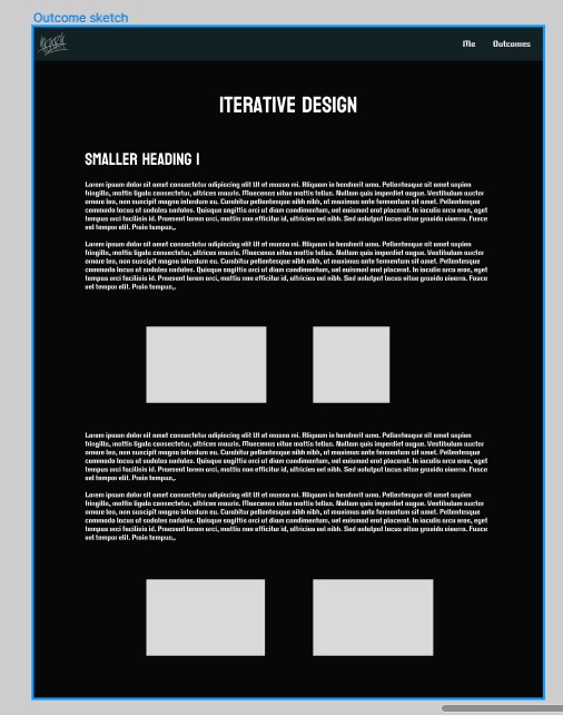
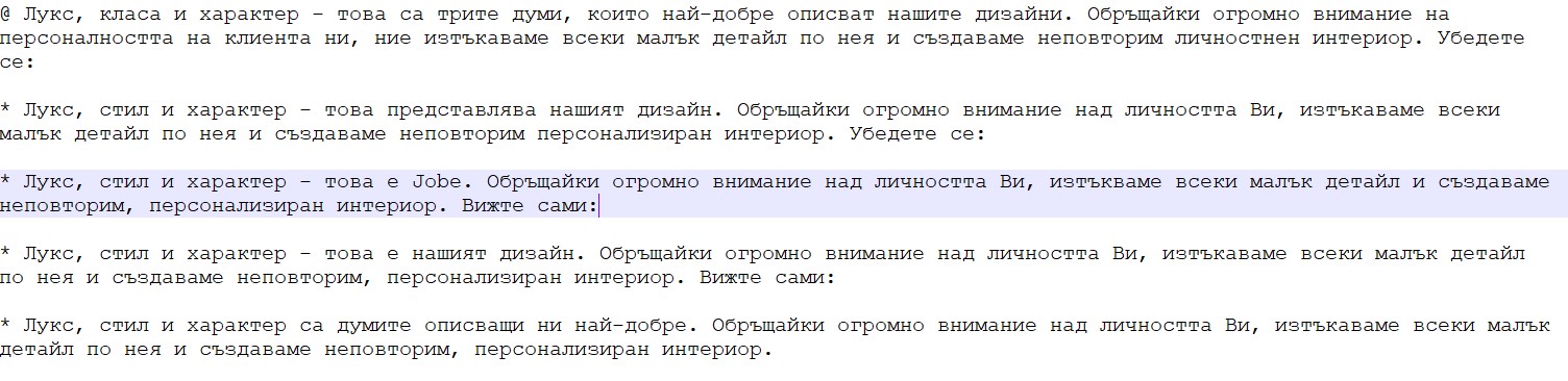
Third Iteration
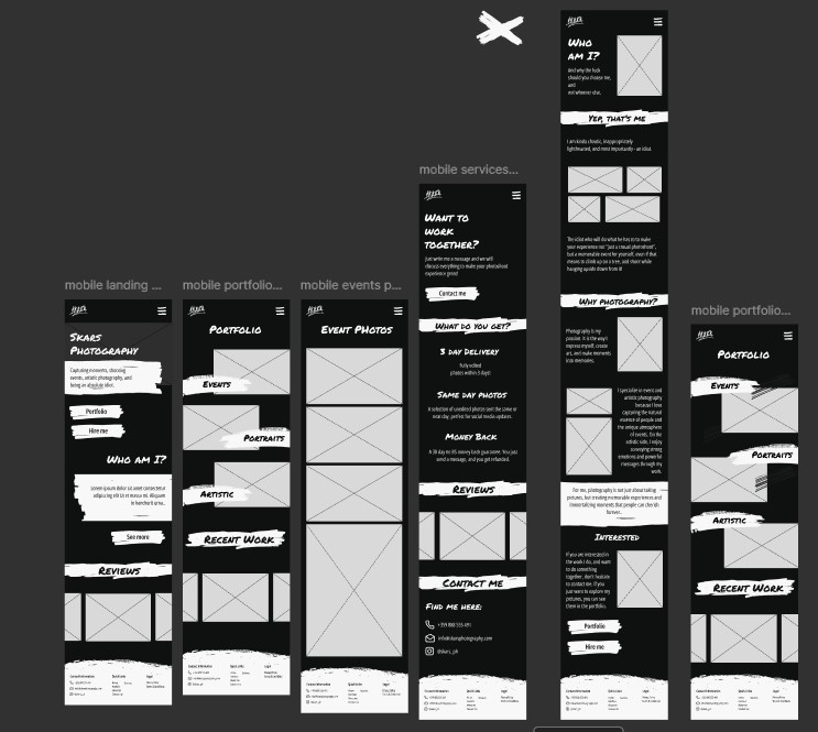
After I conducted user tests, I saw that it was hard for them to go to one page to another, and to scroll through the whole page, because it’s too long. Because of that I decided to create buttons that will help with that.
Two of them are up, as a navigation, and to fix the issue with scrolling I made the articles collapsible.
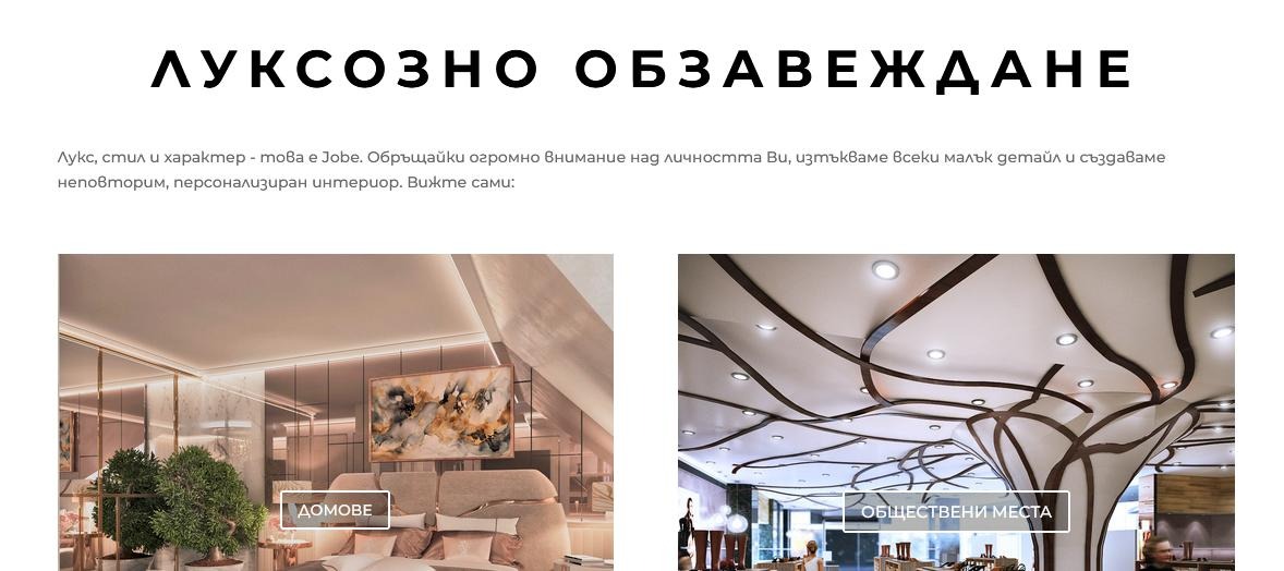
Forth Iteration
After conducting multiple user tests and gathering feedback from a number of people, I found that:
- The headings are not apparent enough.
- The bold text is hardly noticeable.
- Most people want to see It from mobile, which was not possible.
- It was boring.
To fix these problems I changed the headers to a red color.
Made it responsive, so people can see it trough mobile.
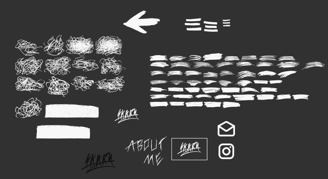
Included more drawings and animations, and made the bold text a bit thicker and gave it a brighter color.
.jpg)
.jpg)
.jpg)
.jpg)
.jpg)
