In this section I talk about myself, the challenges I went through and the decisions I made to go past them. I also mention my initiative to learn and ask for help, when needed to.

Portfolio Decisions

Backstory

Starting to think of how to create my portfolio, I went through a lot of ideas. Having my previous portfolio based around chaos, this time I wanted to differentiate, and make something based on my passion for photography.

Ideas and Inspiration

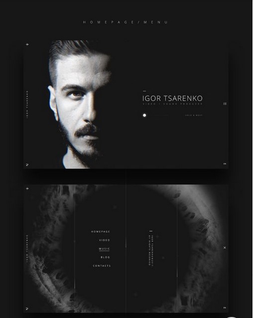
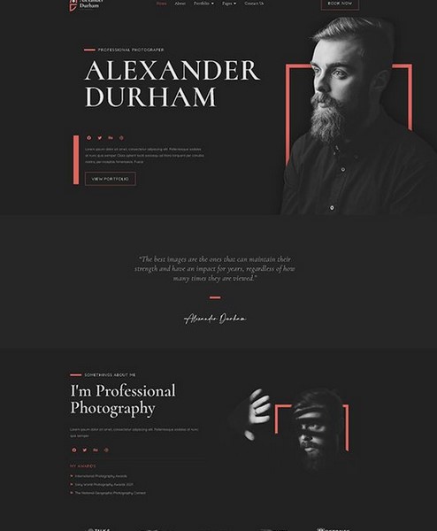
Having made this decision, I did design pattern search, inspired from cmd methods, by looking at different photographers’ portfolios in Dribble, Pinterest and Youtube.

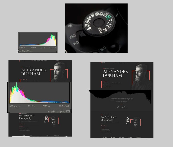
I then did a brainstorming session, where I started with the keyword photography, and made some associations with it. By that I got the histogram, camera wheel and lens elements, that I wanted to somehow include on the website.

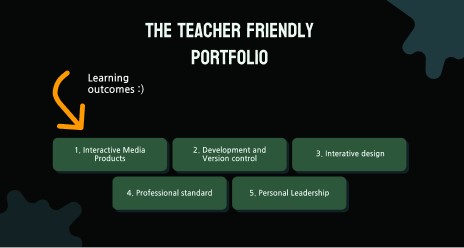
After a lecture, where we talked about how our website should be easy to use and shouldn’t make the teachers struggle, I ditched that idea, and decided to make the “Teacher Friendly Portfolio”. The idea behind website was to make it as easy as possible for the teacher to access and go through the information, present in the portfolio. I then made some examples and prototypes of that.

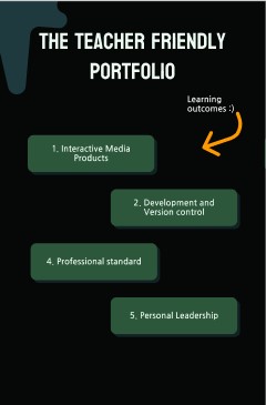
That, then, was also thrown away, due to another lecture about the portfolios, where we were told that they should have an element from our personality in the design. Since “Teacher friendly portfolio” was based around teachers, but not me, I had to ditch this idea as well.

After I threw these two concepts away, I did a reflection on what and how do I want to make. I decided not to go with the photography idea, and to continue the handwritten style from my previous portfolio, but not use paper buttons, and make the writings digital.

Design Decisions

When I started developing my portfolio I started structuring it as to have text on the side, and pictures on the other.

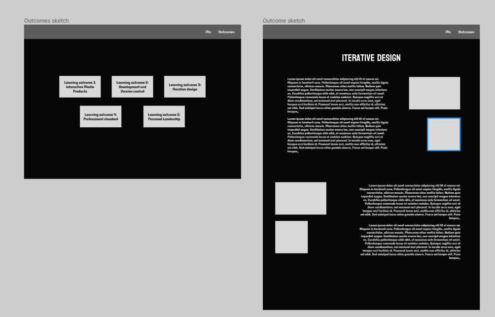
Afterwards I saw that this will be too hard to implement with the type of content I am providing and with the format of the pictures, so I made the decision to have the content first and then the pictures and proof.

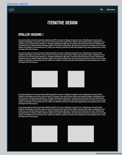
That decision really scared me, because it is not very pleasing to the eye, and you must go through long lines of text. I want to find a solution for that, and I think for now it is better to stick with that layout, because I can make this one more readable, and if I go with another layout, I may screw up a lot and not be able to fix it afterwards.

Tools and Struggles

To do the art for it, I decided to use a graphical tablet, which I’ve never used before. Learning how to do so was a bit of a challenge. Then I had to learn how to use a drawing software, like krita, so I can write somewhere

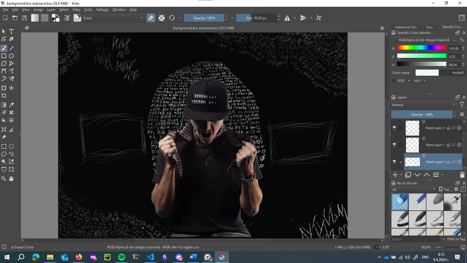
I then had a lot of struggles with separating everything, because I did it on one layer (like the idiot I am) and yeah.. I learned!

The Content

Writing good content for the portfolio turned out to be way more of a challenge than I thought. Since the two previous portfolios that we had to create, had to be in a calendar like structure, where we document what we have accomplished weekly, I started doing it like that in the beginning. Later I understood that this is very incorrect, and it made sense to be honest.

I then started rewriting everything in a word document in a story like way, where I explained myself a lot. When I started to do so, I asked a teacher for his opinion, and he said he likes the way I document, but not the fact that it is still not visual enough. I made the mistake of taking his feedback as enough, and not asking my portfolio review teachers for their opinion, so I continued like that. I wrote a lot of text in a lot of places, and the text was too-much and not so-informing, plus it was in the wrong places.

I then saw what I did wrong, and it was very frustrating, knowing that I had to rewrite everything. What was more frustrating was knowing that people have done a way-better job, and I haven’t. I translate that to “I haven’t done enough work on it”, which angers me to the point of … I don’t even know. It angers me a lot! That by itself makes me a lot happier, because now I have the drive and motivation to do a better job, and to not find excuses not to work on the portfolio, because every time I do, I just remind myself of that feeling, and this I cannot accept. I hate, hate, HATE knowing that I could’ve done a good job, but haven’t, just because I was a lazy ass.

Now every morning for an hour, to an hour and a half I am rewriting the portfolio content, so that it is better 😊.

Other Struggles

It was also a big struggle to understand how to hand in the first portfolio for the review. A lot of teachers told us different things about that. Some - that we can hand in just a pdf with information, while working on the website itself, other - that the information is not that important the first round, but to see that you have started developing the website in a practical way. That confused me and scared me a lot, so I just decided to start developing the website and put everything there, even if that means it will be a utter mess.


Interior Designer

Struggles

In this section I talk about my struggles with working with one very unorganized client with high expectations.

Working with her is a big mess. She wants certain things done, and she puts almost no effort into her own brand and marketing strategy.

In order to continue the project I have to seek her so we can then work on it. I find this very unprofessional, and hard to deal with. It’s like getting a 9 year old to do his homework, which shouldn’t be like that. After all, it’s her brand and her business, so she has to put some effort into it.

I really want to make the project better and to move it faster, but I just can’t, because I come up with some Ideas, which I need confirmation on, I contact her, and then get no response. I then have to contact her again, to b call her for her to tell me that she doesn’t have time, then to schedule a call for a specific date, and maybe hear from her then, while she is fucking driving. Happily, I don’t get paid, and do this only for the sake of learning in a real environment, so I can ditch her at any time.

I also have to work with some kind of guy that develops her website, and is very protective on his design choices, even if I provide logical reasoning and to why maybe he should change something. For example, he has done a part where he has 3 different sections, and they have white text on background with bright and sometimes even white elements. I told him that this is not ok, because it makes the text unreadable, and basically useless. His argument was that, guess what, people don’t read the text… they usually look at the pictures, and that’s enough for them. THEN WHY WOULD YOU PUT THE FU*KING TEXT IN THE FIRST PLACE???

So yeah, in conclusion it’s my first time having to deal with people’s stupidity and not knowing what to do about it, which I believe is a good learning experience.


Photography Instagram Profile

Intro

I am currently learning and practicing photography in my free time. In order to improve my skills I started going out every weekend and taking pictures on whatever catches my eye. That’s how I started doing street photography.

After creating a few images I was proud of, I got the idea that I should try to show them somehow to other people (other than chat).

The Decision

In the beginning I was very scared of making any social media account or showing of in any way. I was actually very anxious and very scared of expressing myself and having conversations with people, even if it is hard to believe (I worked a lot on it, and now I almost don’t give a shit). After I got the positive feedback from friends and teachers, though, I decided to go for it. That’s how this profile was born.

Now What?

Great, now what? Do I post everything that I have? How do I post it? What should I write on these posts? What do I write in my bio? Should the account be normal, creators or a business one, and does it even matter?

To find an answer to these questions, I started searching for best, good, and bad practices on Instagram and did some competitive and trend analysis in order to see what is trendy now, and how can I differentiate. I decided to:

  • Post 3 pictures a week
  • Create at least one reel a week
  • Have a rough and ironic tone of voice

Content Insight

Initially, I followed trends on social media, using popular sounds and imitating other creators, but it felt twofaced.

I then started infusing my humor and interests into my content, being more authentic. Surprisingly, my most successful reel was one where I ditched trends and hashtags, just doing what I thought was cool.

Lesson learned: being myself resonates more with audiences, so I'm doubling down on it.


Learning Design Tools & Methods

Figma

Because I thought I am not good enough with Figma, I decided to learn it from the beginning. That way I will know I understand the tool properly and know how to do basic but important things.

To do that I searched for tutorials in YouTube and found this one. At first it went trough basic stuff, like creating shapes, editing text, creating vectors, the design tree and so-on, but then it progressed to more useful material, as saving different color and text types, so they are reusable, creating elements and variations of them, making use of auto layouts and grids and more.

Here you can find the figma document, where I experimented with the different tools in a sandbox-like environment

After finishing the tutorial, I understood the basic functionality of Figma, but I am still poor at creating designs, so I will have to practice that more.

Photoshop

Since I had almost no real experience with Photoshop, and by now I’ve always used Lightroom for my photos, and switched to Photoshop, only for cropping stuff out, I decided it is about time for me to finally learn It and start using it. /p>

That realization came when I wanted to make a photo, I of mine more dramatic, by adding light, and I searched for tutorial on how to do it. You can see the result below.

  • Before
  • After

I then got really inspired, since I was amazed by what things you can do with it, so I started following this set of tutorials. By now I’ve learned the basics of how layering, blending modes, masking, selections, and some shortcuts. Below you can see some exercises that I’ve done, following the tutorials.

Here I tried adding a sunset to the picture.

  • Before
  • After

Then I did some posters, practicing changing backgrounds, selections and blend modes. I know that the fonts on the bnw poster are horrible, but I didn’t want to bother with them, I just wanted to see how to decorate it.

Here I practiced selections and changing backgrounds:

  • Before
  • After
  • Before
  • After
  • Before
  • After

The cat example was extremely interesting, because I learned how to select fur and hair in particular areas.

Here are some more examples on how I practiced masking in particular:

Creating PNG animations

I had to learn creating PNG animations (APNG), so I could implement them in my portfolio. To do so I googled “what are PNG animations”, and “how to make PNG animations”, and found an old Youtube tutorial, explaining everything very simply. In the tutorial the creator made the animation in photoshop, which I didn’t have access to on current device I was currently using, so I searched for other methods. That’s how I found the apngasm tool.

I quickly grasped the use of it, since it is not complicated at all, and tried to animate my drawings, but failed. They all had to be the same size/scale. Now I had to learn how to resize/rescale a lot of images. I found tools, made specifically for that, but I thought that this is an overkill. I managed to find a solution trough gimp, using a plugin (Batch Image Manipulation ) that edits a whole batch of images.

Using it I rescaled every image to the same size, and then I was able to create the PNG animations.