Trends and Developments
As designers, we need to look at trends and developments. Let me emphasize - NEED to. That is the way we
keep up with what people like, what they would buy/use, and what not, why our competitors are getting
ahead of us and so on. If we don't spend enough time to study the current trends and the newest
developments in design, we are on a path to slow death.
Now that I've made an over-exaggeration of it, let me tell you how I keep up with things in that field.
By now I was only listening to podcasts related to that, mostly studying user behavior, and have been
subscribed to some email newsletters, on the topics of marketing. Recently I started following youtube
channels, on the topic of ux/ui design and web development, and also created an account in Dribble,
which was shown to me from Dirk and is a really useful information source.
Week 17
In order to create the separators and scroll up button I looked trough the different design trends and
why are they implemented. I went trough various examples and looked for inspiration in Dribble, and
decided to make mine, the way you see them in this very page. I made them in a way that is consistent
with my style and also they serve their purpose effectively.
Also in the group project we went trough a lot of different marketing and web design trends in order to
create our landing page, and also the vertical form videos.

Iterative Process
If we want to progress, we need to know what we are doing wrong. In order to do that, when we create
something we need to take a step back and think - "what could be improved?", and that includes asking
people their opinion on your product, mostly - experts, so they can point out your mistakes. Luckily, I
have 3 professors, at the university, which I can ask feedback from.
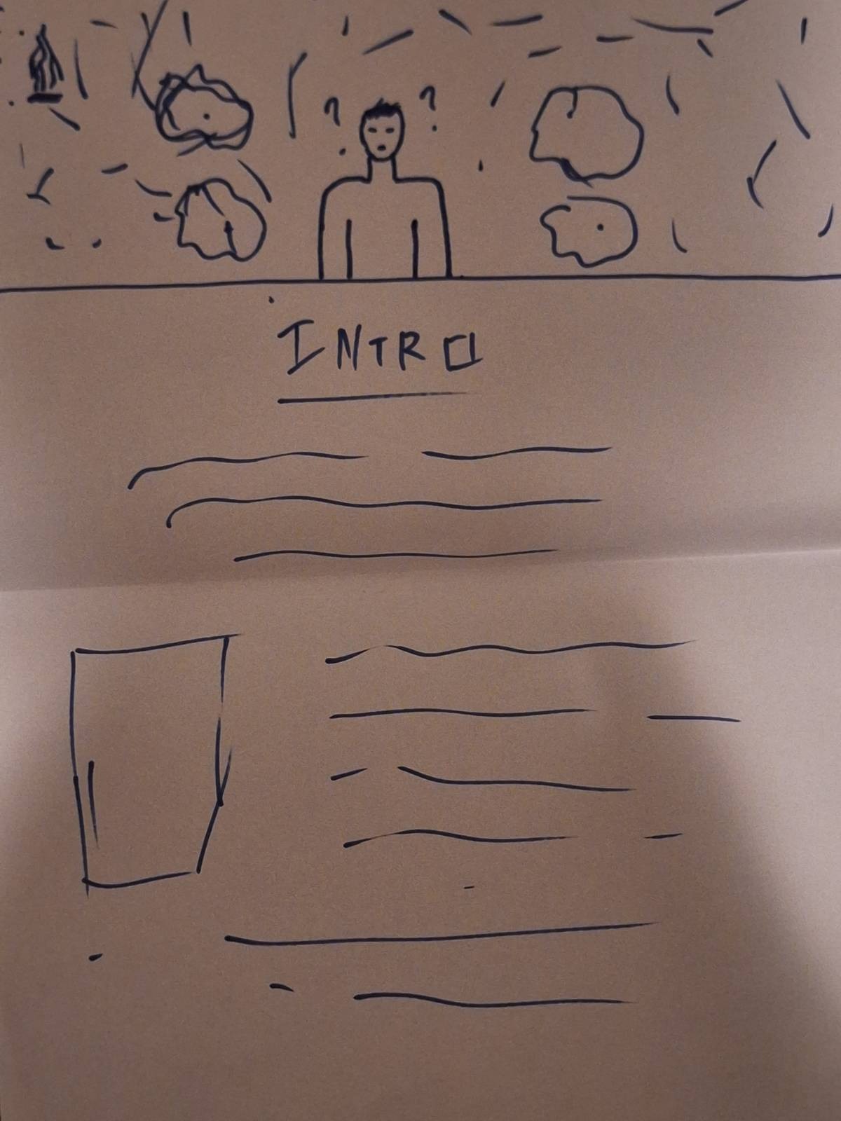
A recent example would be me working on my portfolio page (this thing that you are on). I first had my
low-fidelity prototypes and immediately started trying to create the website. That was obviously a big
mistake, because I first need to create a high-fidelity prototype for it, otherwise it would get pretty
hard and I will waste a lot of time. Then I asked prof. Dirk for feedback and he told me to first do a
high fidelity prototype in figma, and then start building the website. That way I can see if my idea
will work out, and then build it. So, that is what I did, as you can see in the included pictures.
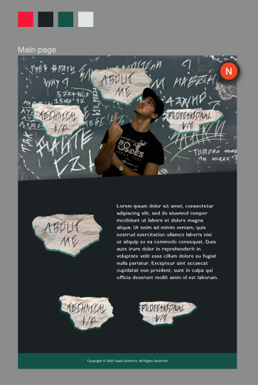
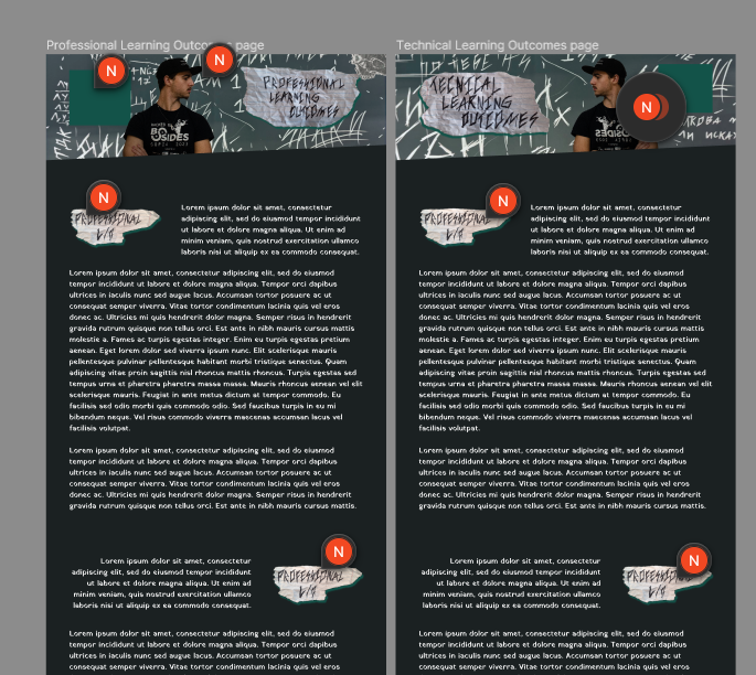
Then I asked for feedback for my prototype, professor Lody, and he told me that he likes the idea a lot.
He suggested that I take inspiration by the punk-rock theme and to add elements that are in that style
and also told me to try to create the other pages first, so I have the layout and flow of the whole
website. And so, once again, that is what I did:
So, after that, I again asked prof. Dirk for feedback and he told me, that he likes it, but I should try
to make the things in the notes more readable, and that I should research different ways to separate
elements.
Week 15
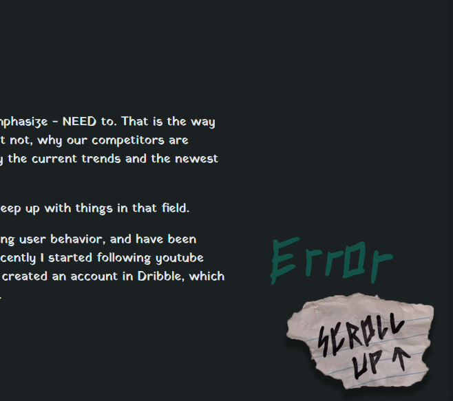
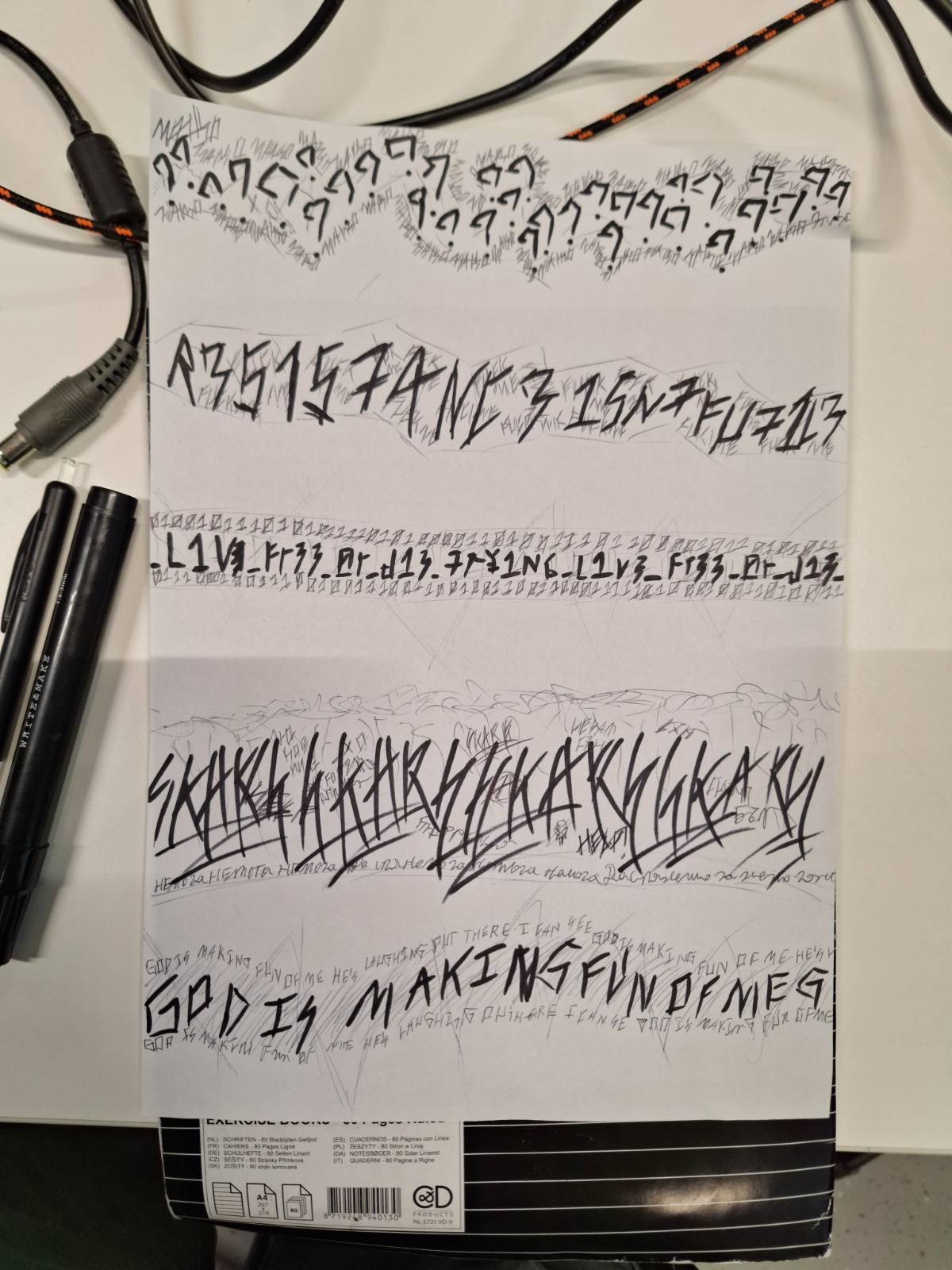
Yeah, I did the research and I managed to create my own separators. I am quite happy with them. You will
probably be able to see them in the website itself or, you can see the real life drawings in the
Interactive Prototypes part of this page.
Week 17
This section may be very similar to this. Sorry if you already read it.
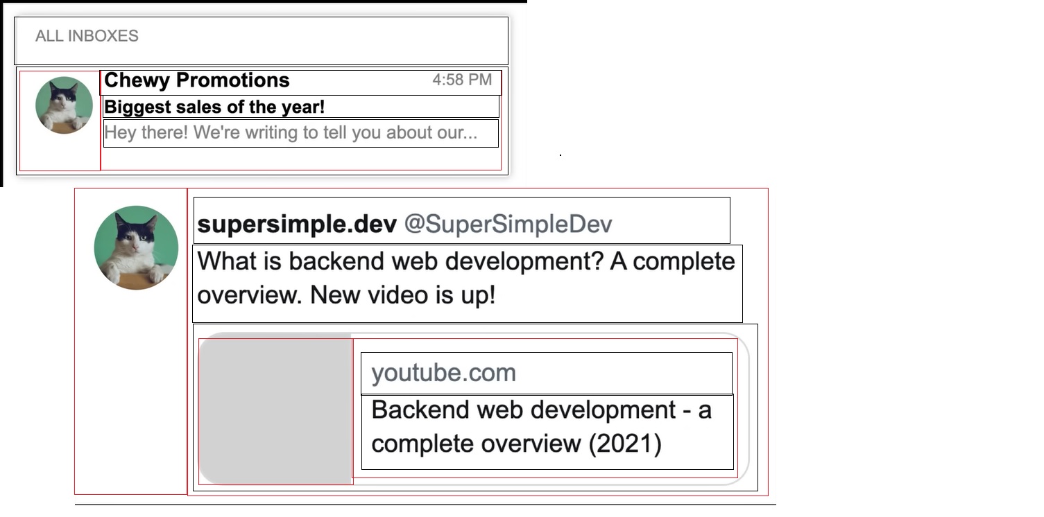
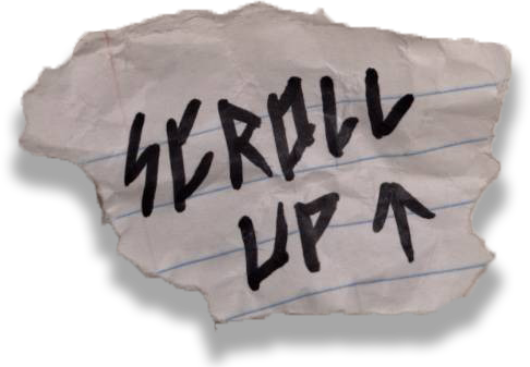
I conducted research by showing my portfolio to people who had never seen it before, and analyzing their
behavior, I discovered that it was difficult for them to do things like scroll all the way up, move to
different pages, and understand what a button was and was not.
To resolve these issues I made a scroll up button that is always at the bottom of the page and fits the
style, I photoshopped off only the text for the "About Me" part because it was mistaken for a button,
and I added extra buttons to the header to help the user navigate to the different pages more quickly.
Two of the buttons on the main page were similarly difficult to read, so I replicated them, checked
around to see if anyone could read them, and then reinstalled them on the site.

Interactive Prototypes
Making interactive prototypes is one of the biggest parts of our studies, and it is vital for us to
learn
how to do that. I want to be able to create good prototypes, that follow good UX practices and to create
decent, well structured, web pages.
To achieve that I started watching UX and UI content on youtube, I started a design course at SoftUni,
so
I can learn the basic design principles, and I started learning figma, and doing my portfolio page
prototype on it. You can see instances of my prototypes in the iterative process section of this page.
Week 15
So, I started to improve the prototype for my portfolio page. I needed to add some of the pictures and
the actual text of the portfolio, and also fix my grid, because I did it wrong according to Dirk. I
researched a bit, watched a few tutorials and now I created a 12 column grid, that helped me with
restructuring the elements in there a bit and make it look better. I also added some real text and
photos, to see how would they align. I am happy with how the text is turning out, but I have no idea how
to make the pictures fit. I will ask for feedback for that, because I really struggle with that. I also
experimented a bit and added a separator, but I am not sure if I will use that element, or something
else. For now the prototype for one of the pages looks like this:
As mentioned in the Personal Leadership professional learning outcome, I needed to take some time to
learn HTML and CSS, so I could start to make the prototype a working webpage. So I took some measures
for that. I watched some tutorials and did some exercises, which covered founding HTML and CSS
knowledge. Some of them would be exercising layouts, creating different button styles, different display
functions, different positioning functions, flexbox and grid, and more. Some of the exercises I’ve done
you can see in the pictures below.
I also included some pictures for the website, which I cut out and used, but you
have probably already
seen them. They are literally in the header of every page. Besides that, I created a variety of
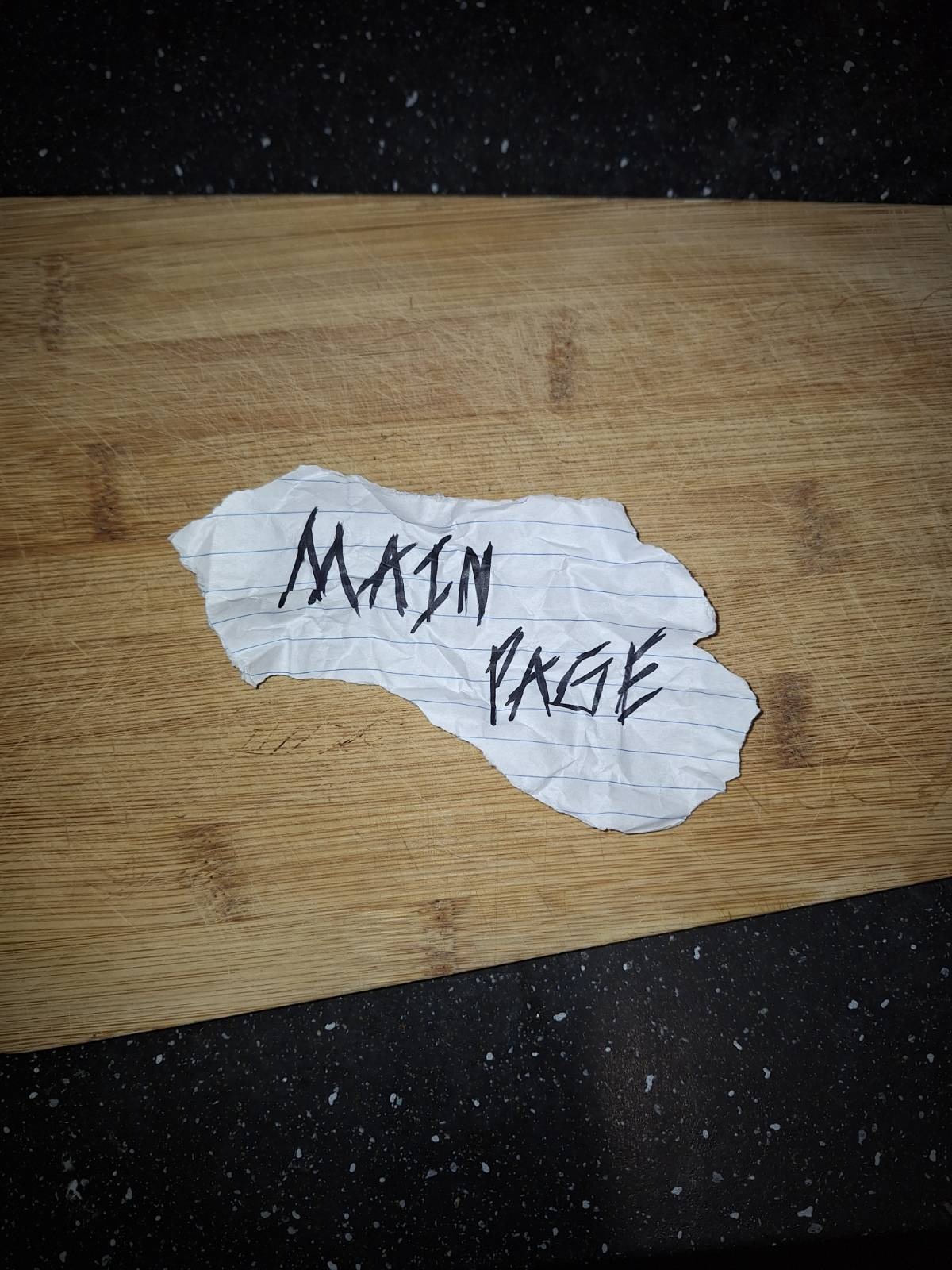
separators, as suggested by Mr. Dirk, drew some backgrounds, which I then photoshopped, and created a
main page button. You can see all of these real-life props below.
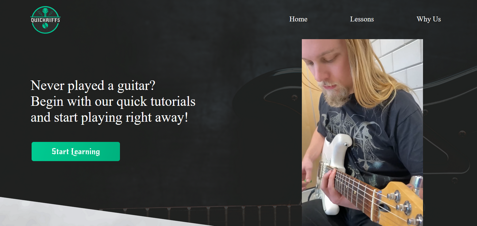
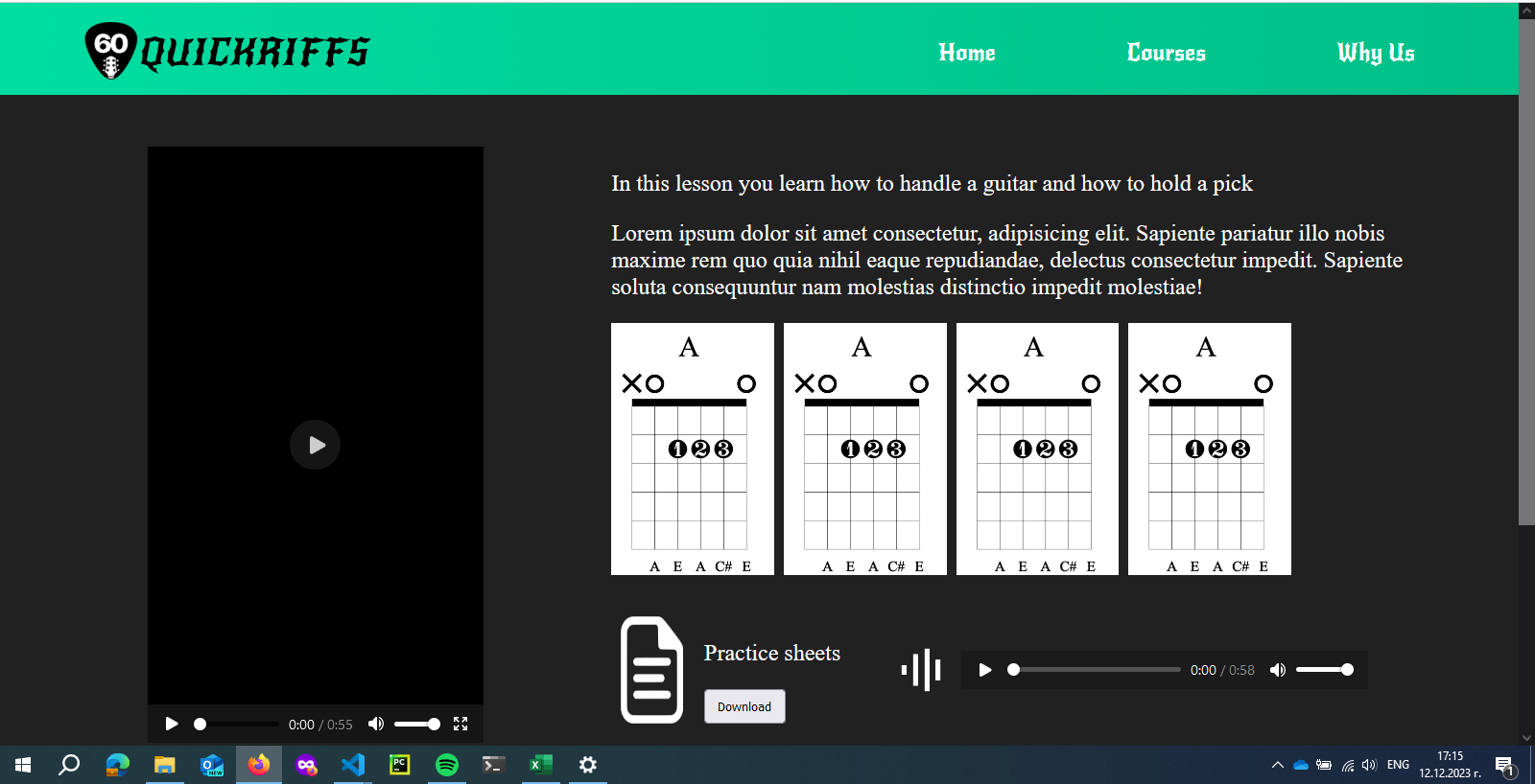
I also had the task of creating the lesson page for our group project. The skills I acquired while going
through the tutorials and learning about grid and flexbox, as mentioned above, came in handy. I still
have some more styling to do, but for now, it looks like this:
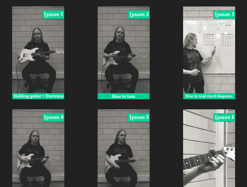
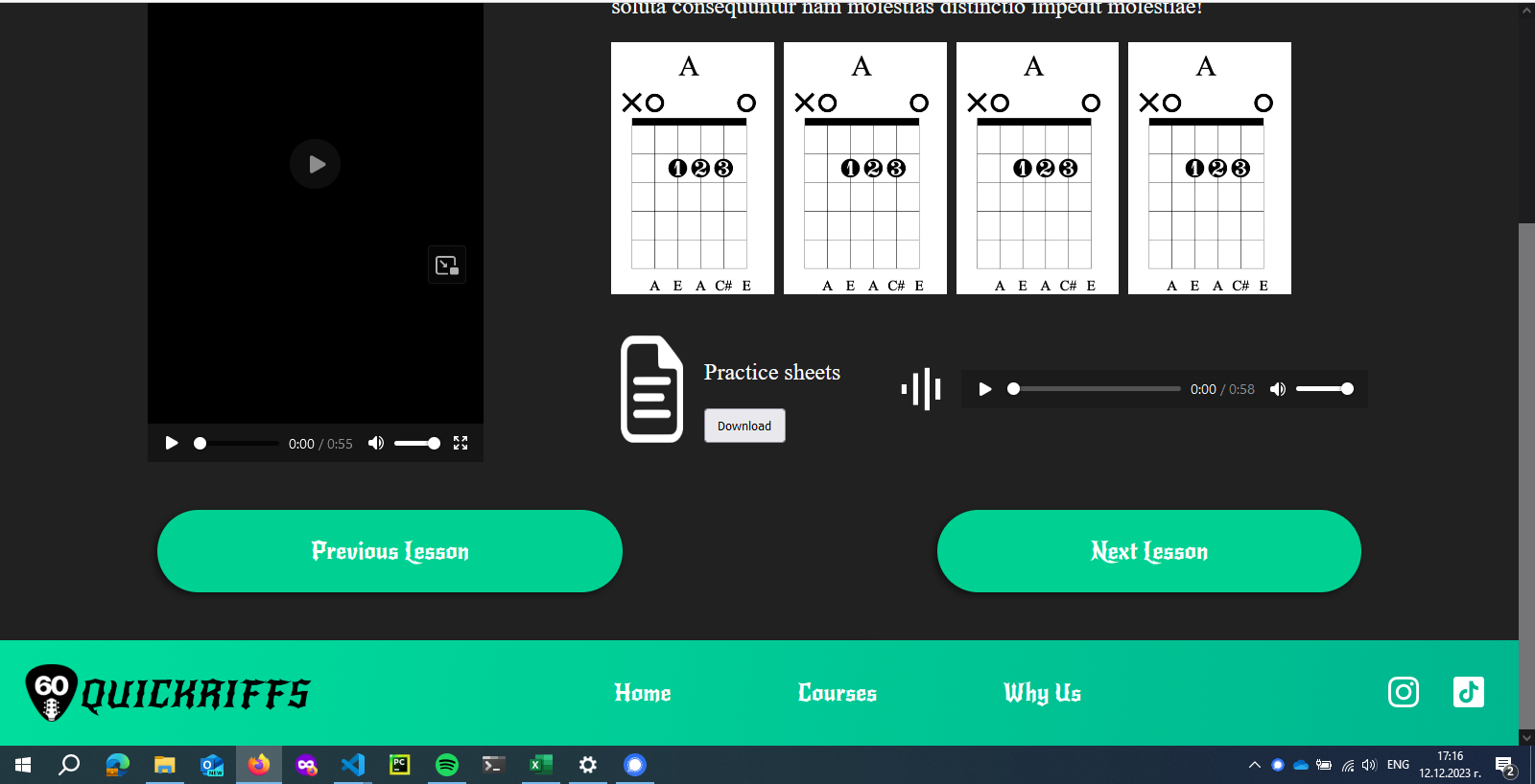
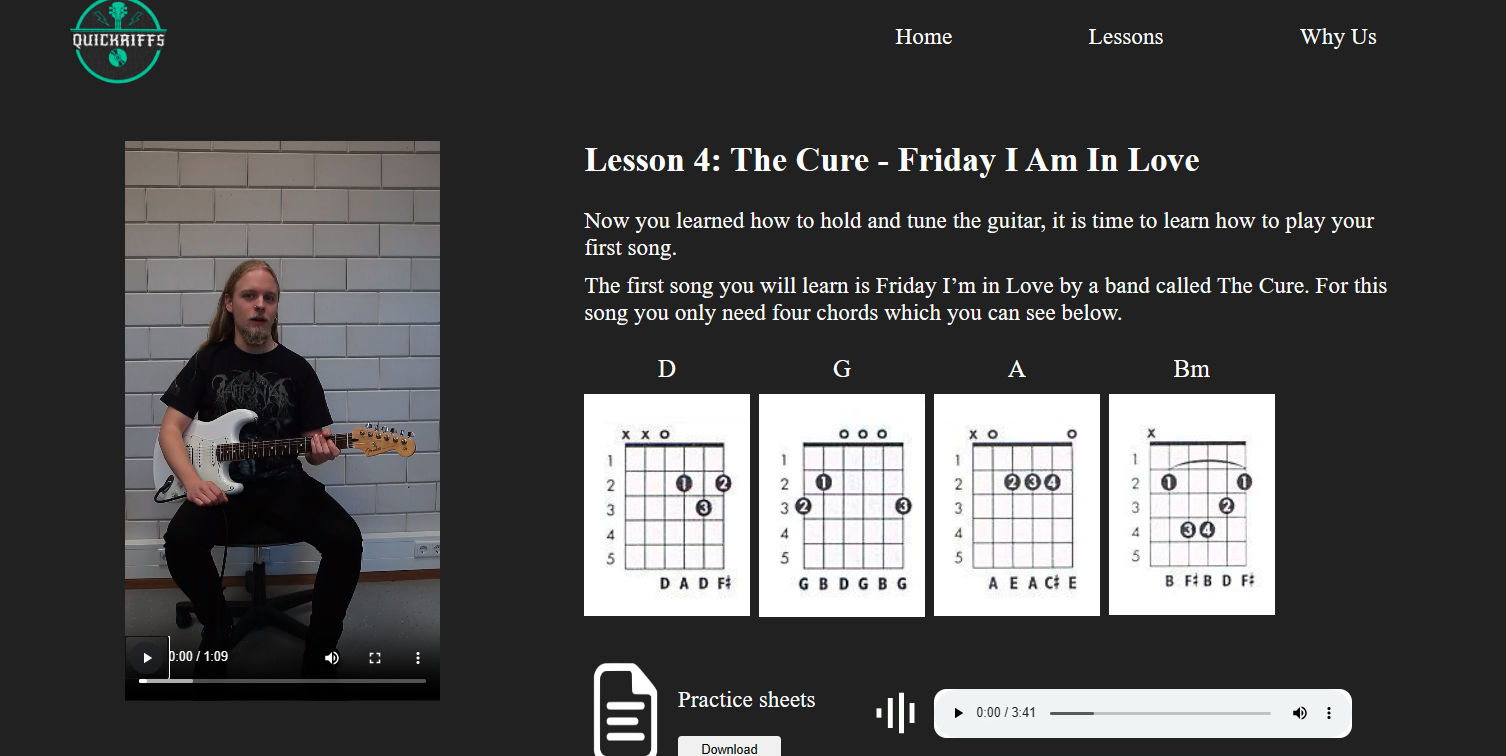
week 17
In the group project I worked on the pages for every single guitar lesson. Therefore I had to make it so
it is easy for the users to interact with the page and also to provide the right information. It had to
have a video, description, chords, downloadable music sheets and playable music in it. I managed to put
all of that into the page and made it all work. I also used both grid and flexbox to structure it good
and to make it work in different devices.
I also worked a lot on writing semantic code, that can be easily understood by anyone. I think I
managed to create a good website that is easy enough to use, and I am happy about it. There are some
styling issues that need fixing, but they aren’t that big in my opinion.

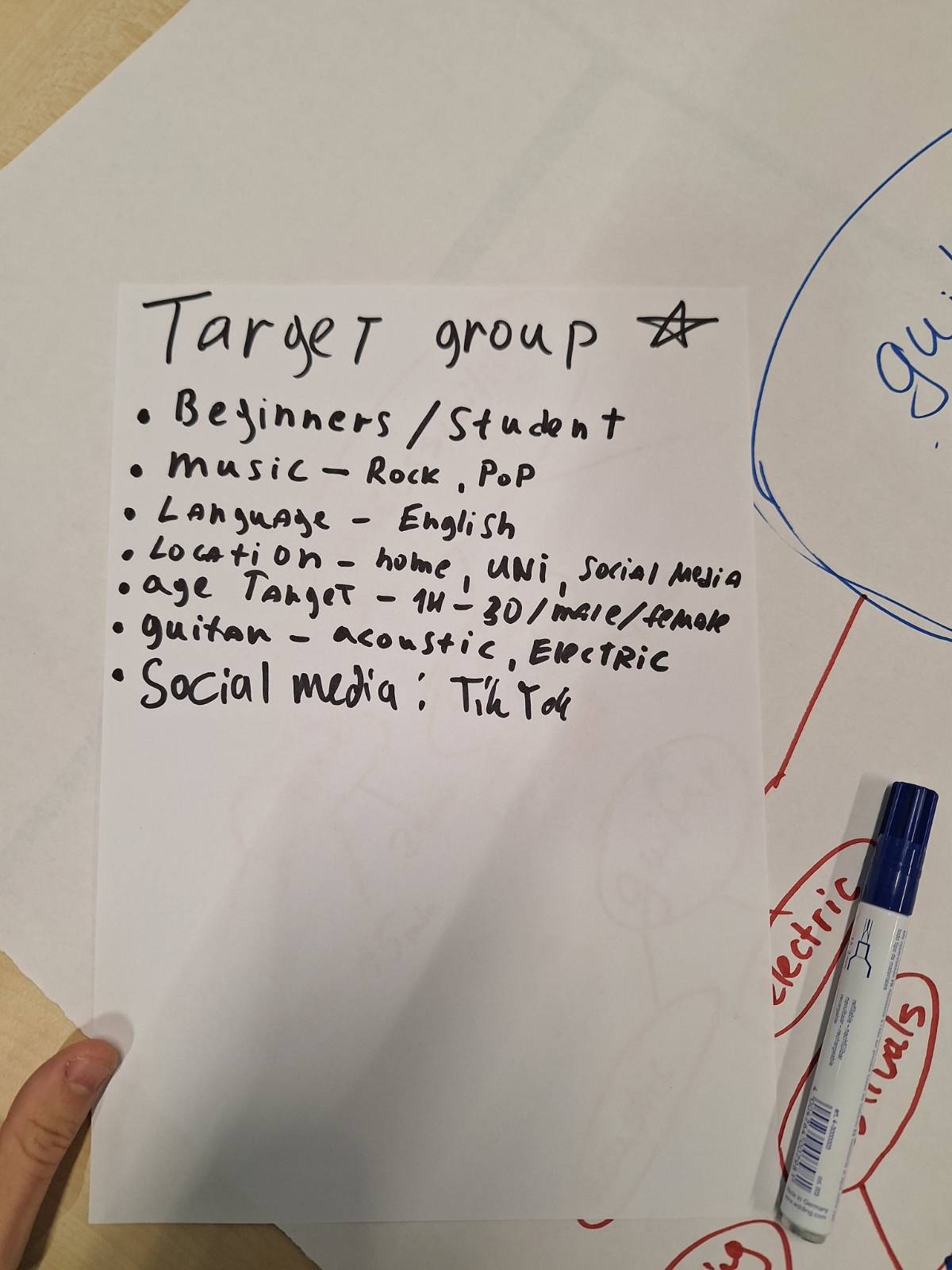
Target Group
Creating a good target group and persona is vital for UX design, marketing and even creating and
modifying your product in general. You need to create your product/interview/questionnaire/web page
according to the people, who will buy it, so you need to sort out who these people are. That way you can
personalize the whatever you are doing and make it way more appealing for your audience.
So far, I have worked on one target group which is the one for our group project. You can take a look at
it in the included picture.
Week 15
As for that part, I decided to consider the target audience of this product – you, dear teachers. So, I
thought, 'If I were reading this to assess someone, how would I feel?' The first thing that came to mind
was that you wouldn’t want to read the whole thing every single time and that you would prefer to see
only the new things each time you need to review the portfolios. To make that easier, I added smaller
headings for the weeks in which we need to submit our portfolios, allowing you to start from there with
ease. I also included links in parts where the learning outcomes overlap, so you can easily navigate to
the relevant sections. Hope I made your life at least a little bit easier :)
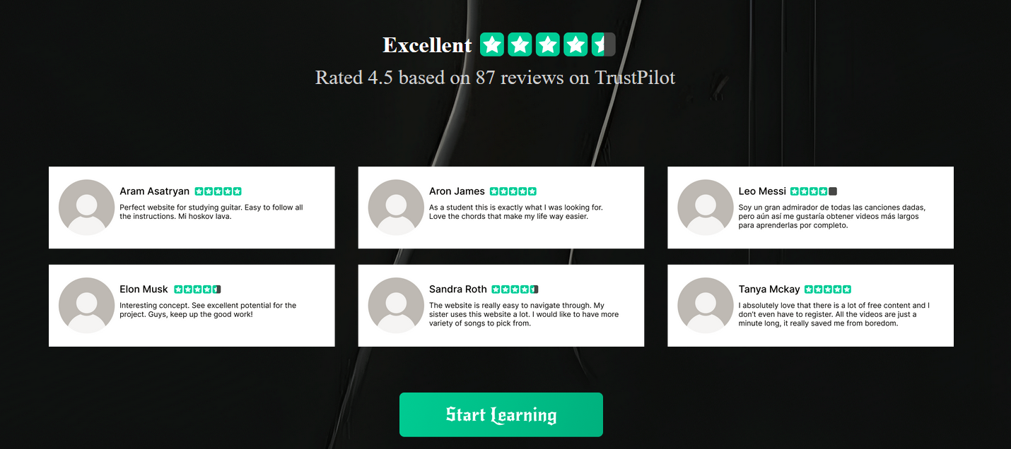
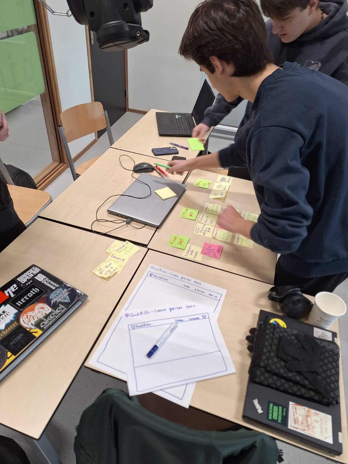
Regarding the group project, we did some user research with some sticky notes, showing them the structure
and Idea of our guitar website, and leaving them move them around and add their own ideas. That way we
gained insights on what they, as the end users, want.
Week 17
As I have already mentioned above, I took the users needs into account, and added a scroll up button to
this webpage, I made the buttons more readable, and I added shortcuts for the other pages in every page.
I hope that I made a good job of making this chaotic website easy to navigate for you :)